Disquietude Vengeance
Official
Merchandise
Designs born from the music, artwork and identity of Disquietude Vengeance.
Featured Collection
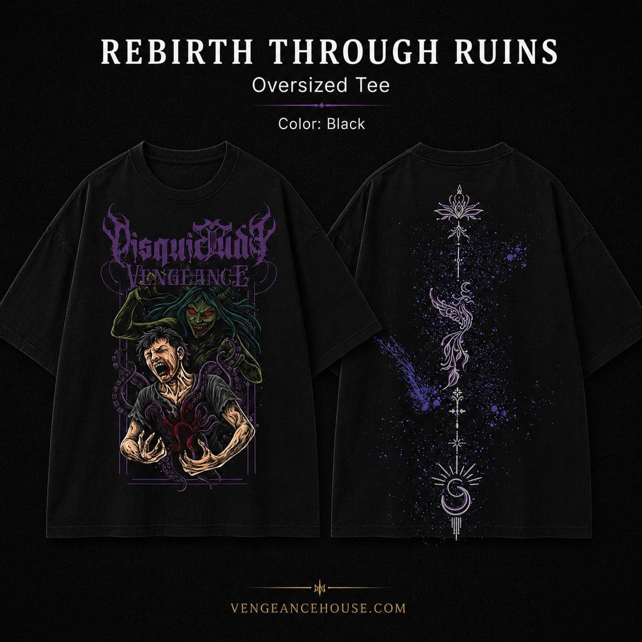
Rebirth Through Ruins
After a year of building around Psycho Sadistic Existence, we wanted to create something different. Rebirth Through Ruin came from that idea, exploring what happens when destruction becomes the beginning of something new.
The Artwork
Destruction, pain and the possibility of rebirth.
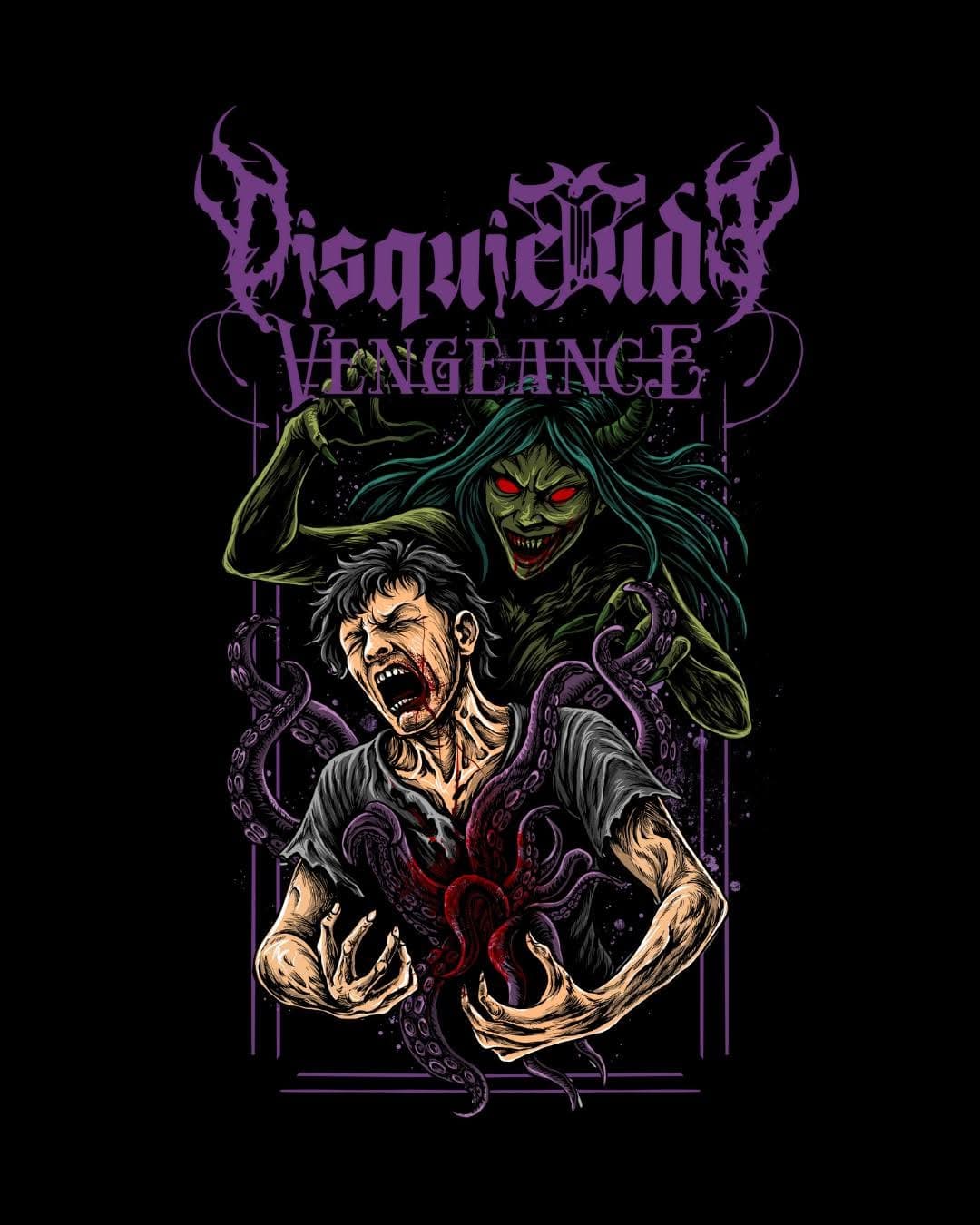
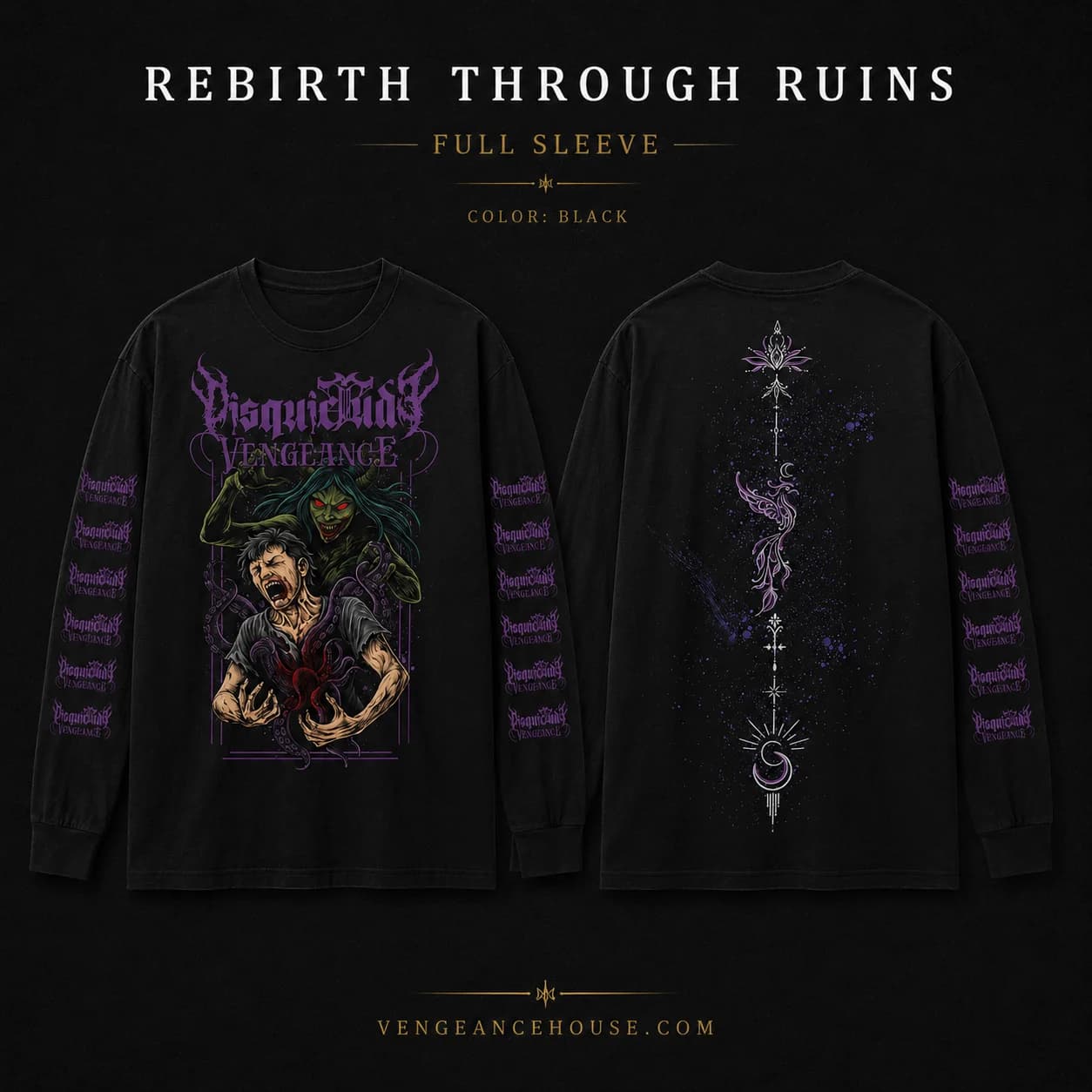
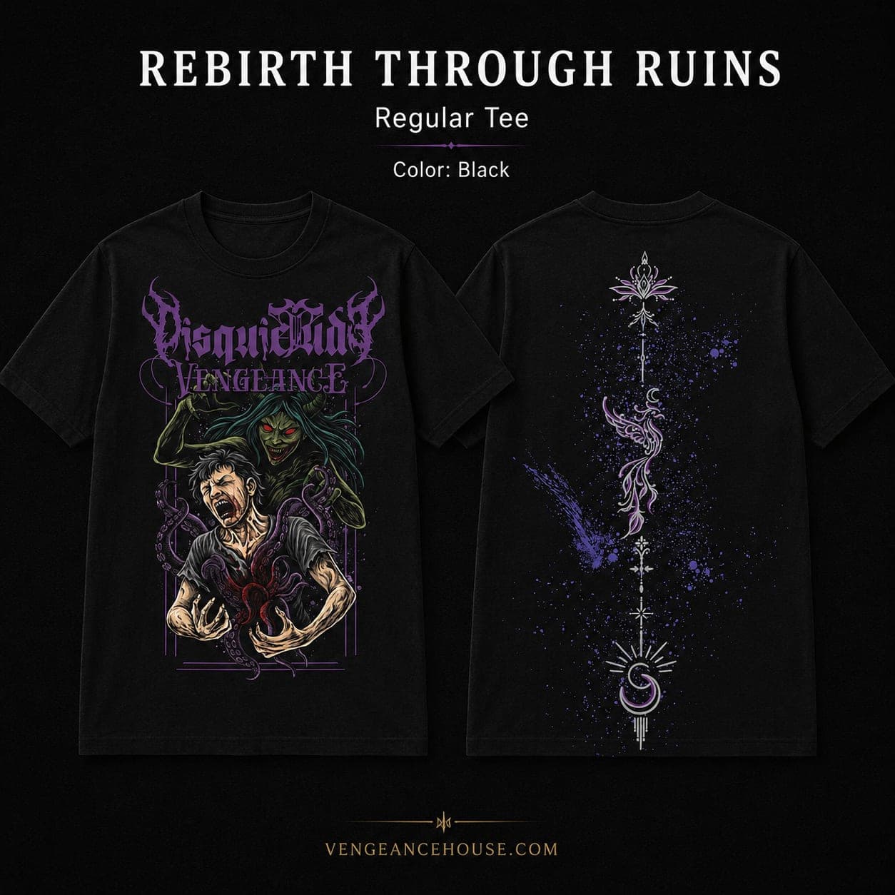
The front of the design shows a broken figure being stabbed by their own shadow. That shadow represents the darker parts of ourselves: hatred, selfishness, jealousy, anger and the thoughts that surface when we are at our worst.
On the back, a phoenix rises from the destruction, surrounded by sacred geometric patterns running down the spine. It represents the other side of that struggle: picking yourself up, rebuilding and finding the strength to start again.
Behind The Design
One side is pain. The other is survival.
After a year of building around Psycho Sadistic Existence, we wanted to try something different. Rebirth Through Ruins came from that idea.
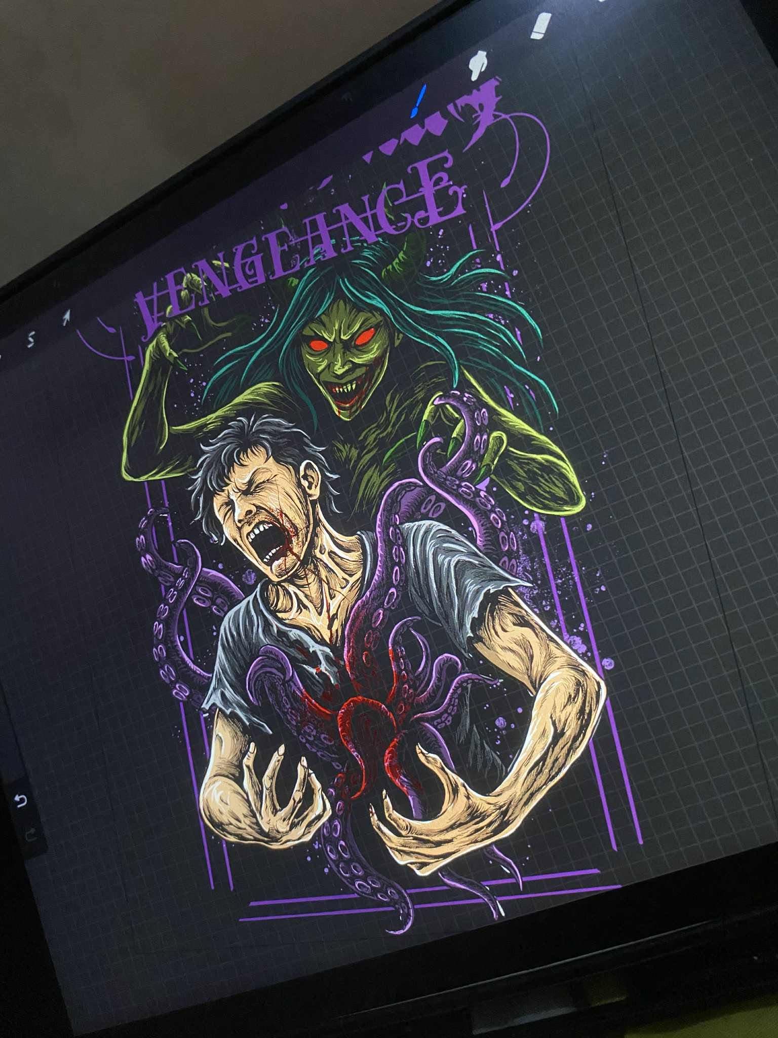
The vision was brought to life by @StealthFangs from Indonesia. The design captures two sides of the same struggle: pain, anger and revenge on one side, and strength, survival and starting over on the other. Both sides are real. Both sides matter.
DV Exclusive
Album Artwork
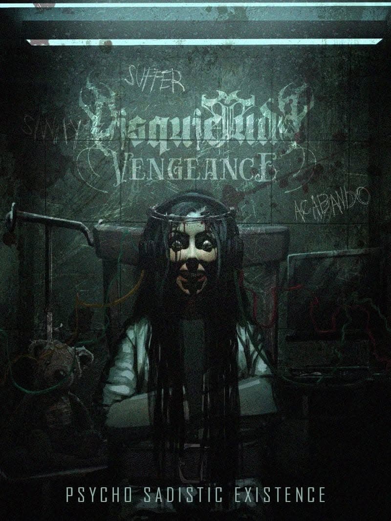
Psycho Sadistic Existence
Have you ever considered talking to yourself?
Have you ever gone beyond the ego that you live with? This is the darkness that we dig into, and this is what we are.
Digging deep within our true selves, facing our darkest fears, and unearthing the rotting cloth from the mirror, we confront the hate and vengeance we carry from the realm of darkness. This psychotic nature is at the core of our art and is vividly presented throughout this album.
The artwork portrays the face of our inner vengeance throughout this journey.
This massive artwork was created by Subham Sarkar. He understood exactly what we were looking for, and we had a great time bringing the vision to life together.
Behind The Artwork
Bringing the darkness into a visual form.
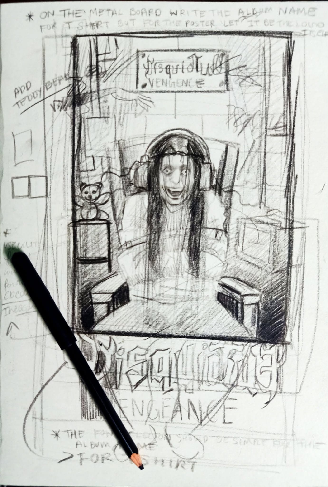
The artwork for Psycho Sadistic Existence was built around the idea of confronting the darker parts of ourselves. Turning that idea into a single visual meant finding the right balance between psychological darkness, aggression and the identity of the album.
What started as a concept gradually developed into the massive artwork that became the visual face of the album. Every detail contributes to the atmosphere of the record, from the disturbing imagery to the sense of inner conflict running through the piece.
Seeing the artwork take shape from an initial idea into its final form was an important part of the album's visual journey.
Debut Album
Psycho Sadistic Existence
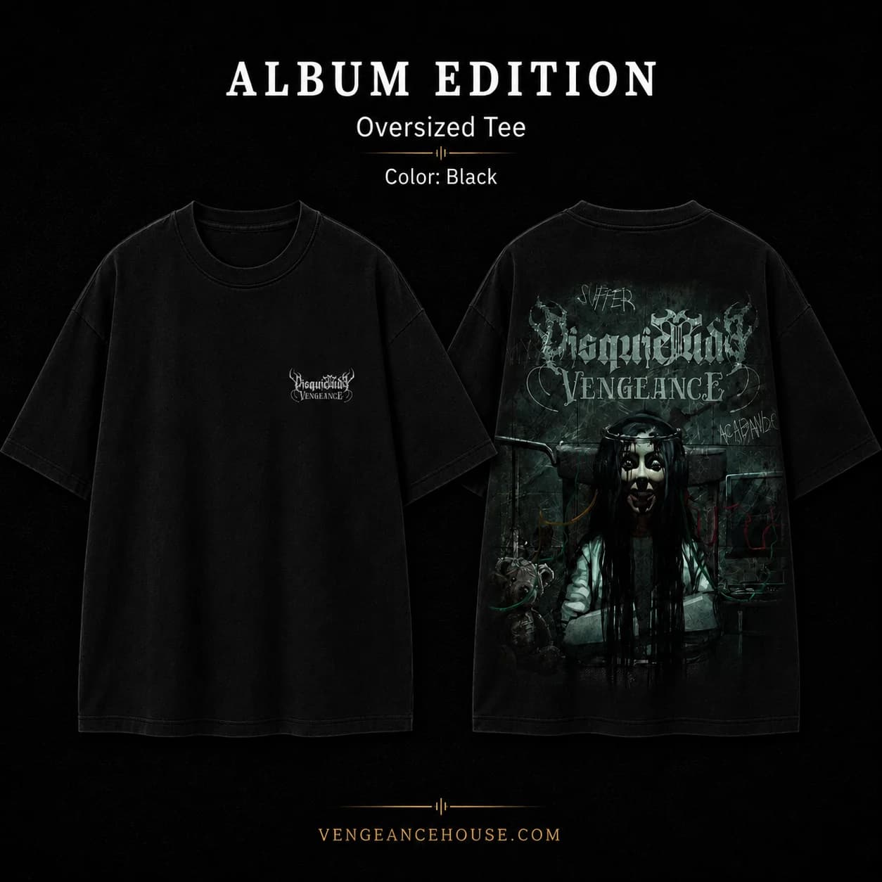
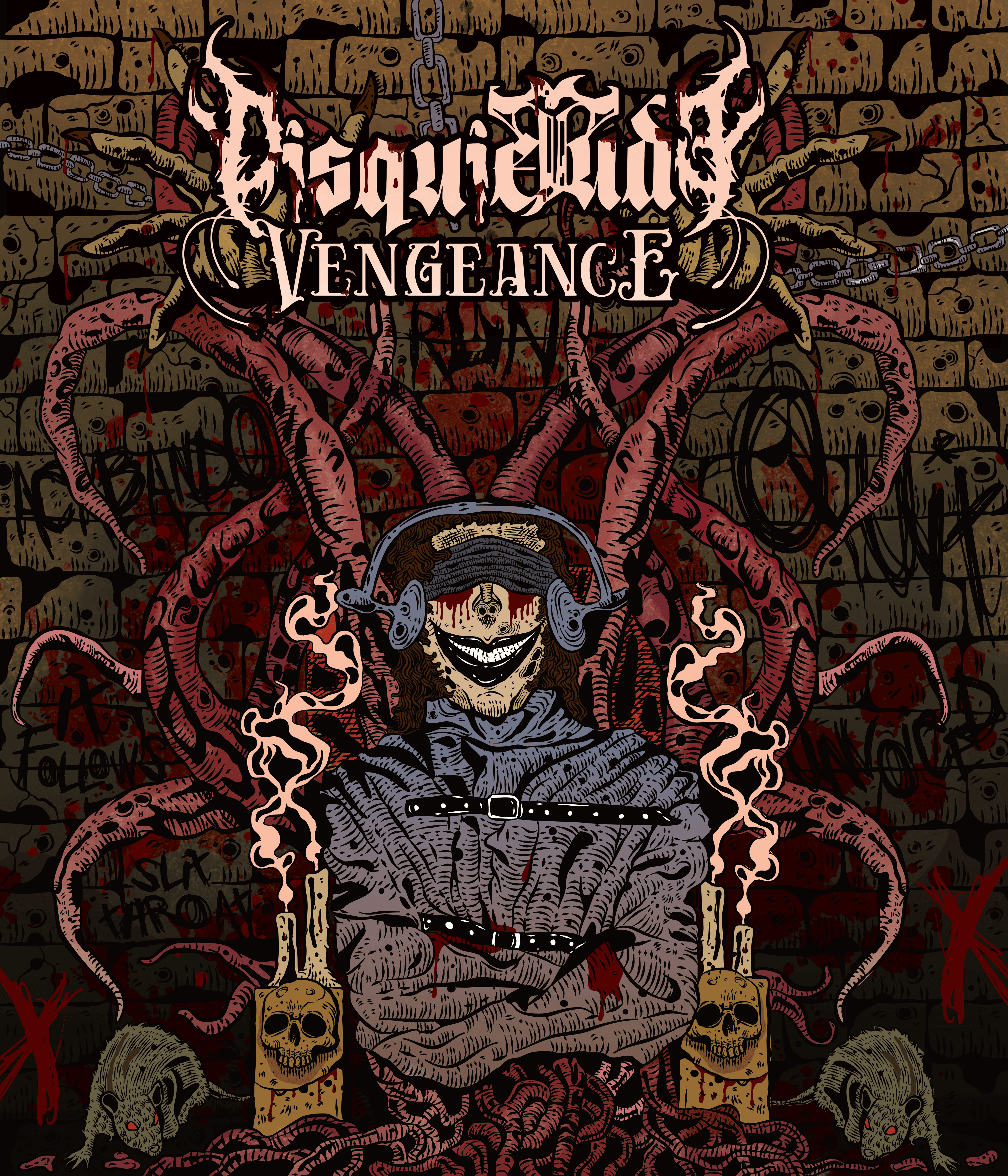
The Artwork
The same darkness, seen differently.
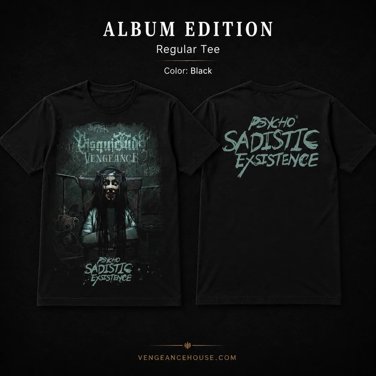
The Artistry Edition started from the same core concept as the original Psycho Sadistic Existence artwork. The idea was kept intact, but given to another artist to interpret through her own visual language.
Black Doll Dhalia took that original direction and pushed it further, introducing additional concepts and a distinctive doodling style throughout the artwork. The result keeps the darkness and identity of the original idea while giving it a completely different character.
It became a different perspective on the same world, rather than a replacement for the original artwork.
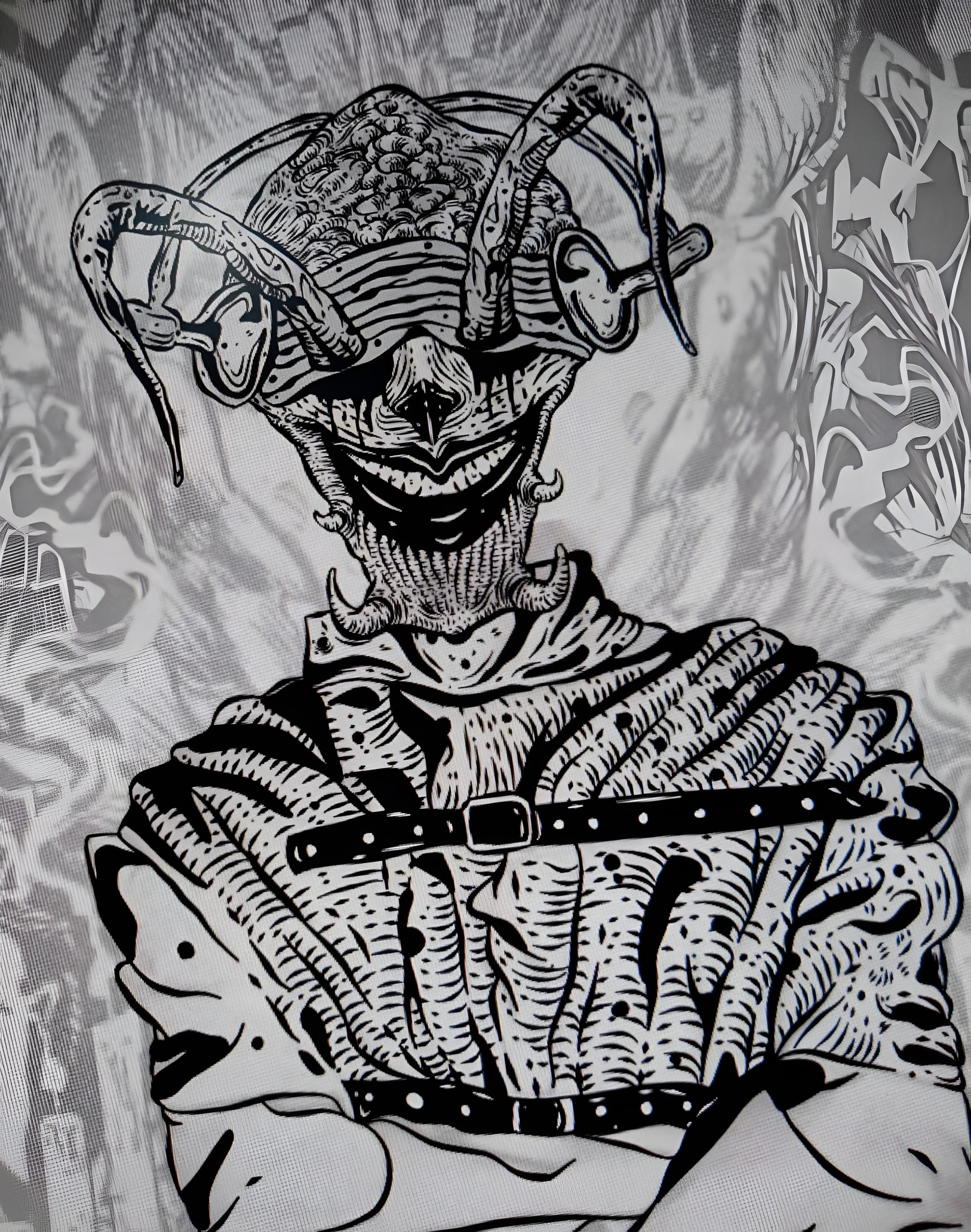
Behind The Design
From artwork to physical pieces.
The Artistry Edition was created as a way to give the artwork its own presence outside the regular merchandise range. The same visual language was carried across the pieces while keeping the edition distinct from the main collections.
It represents another side of the band's visual identity, where the artwork itself becomes the focus.
Special Editions
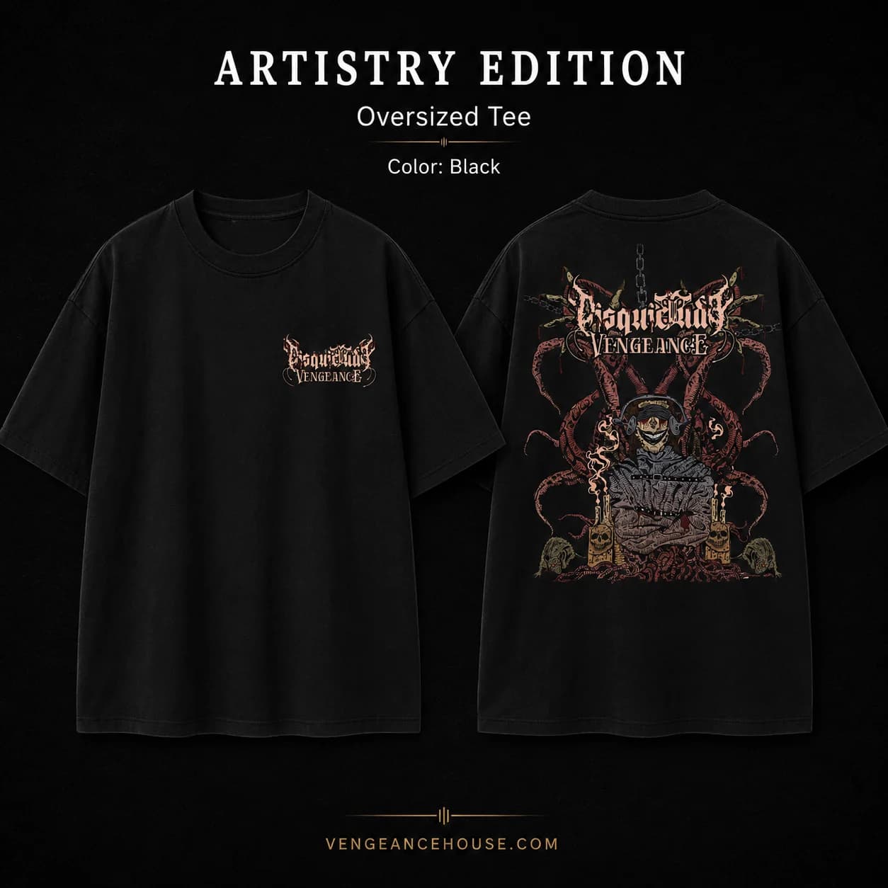
Legacy
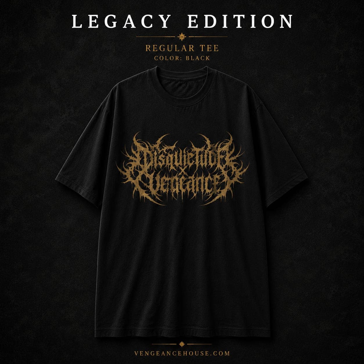
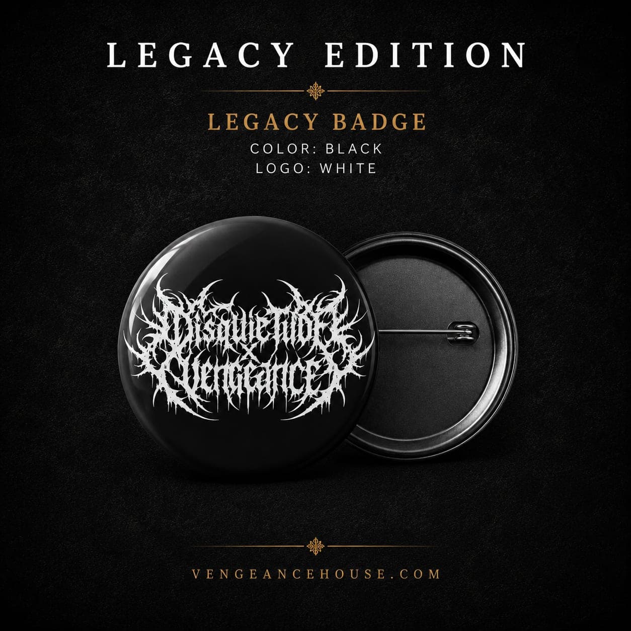
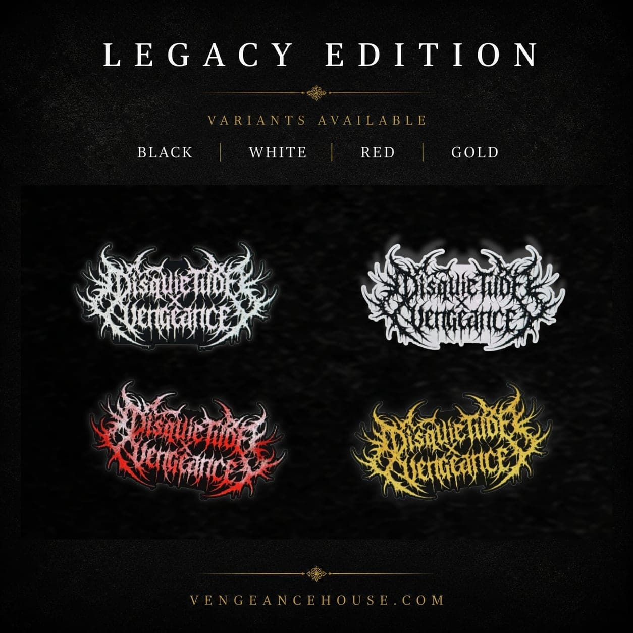
A New Face for Disquietude Vengeance
The Evolution
More brutal. More aggressive. More us.
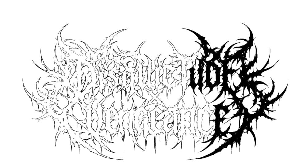
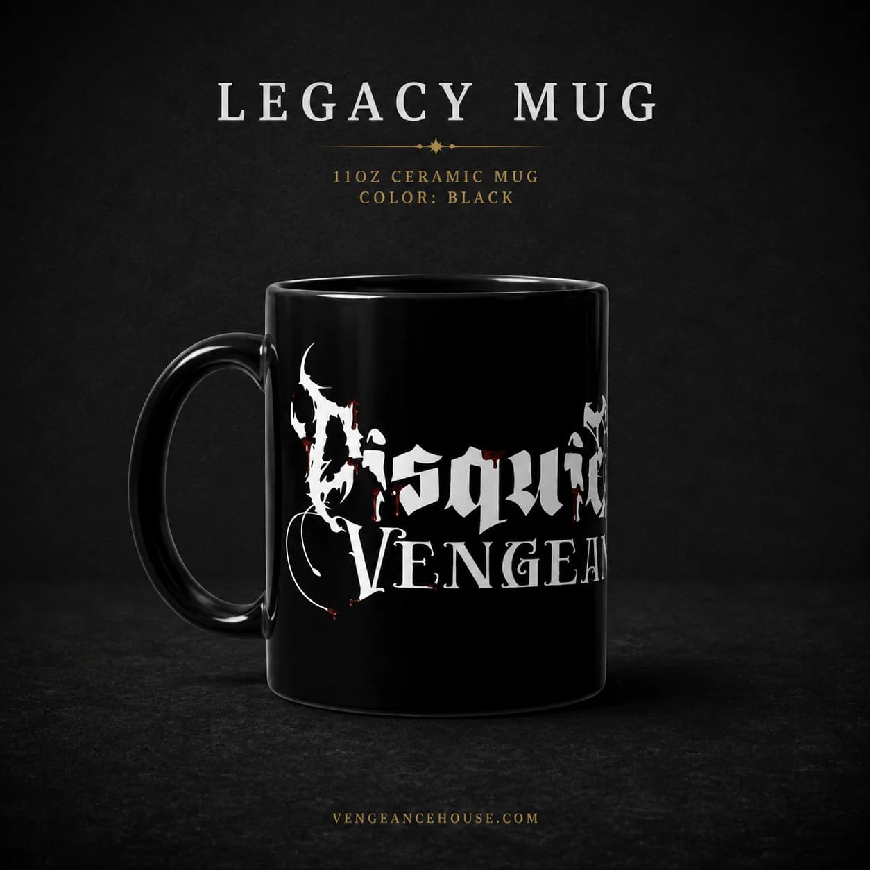
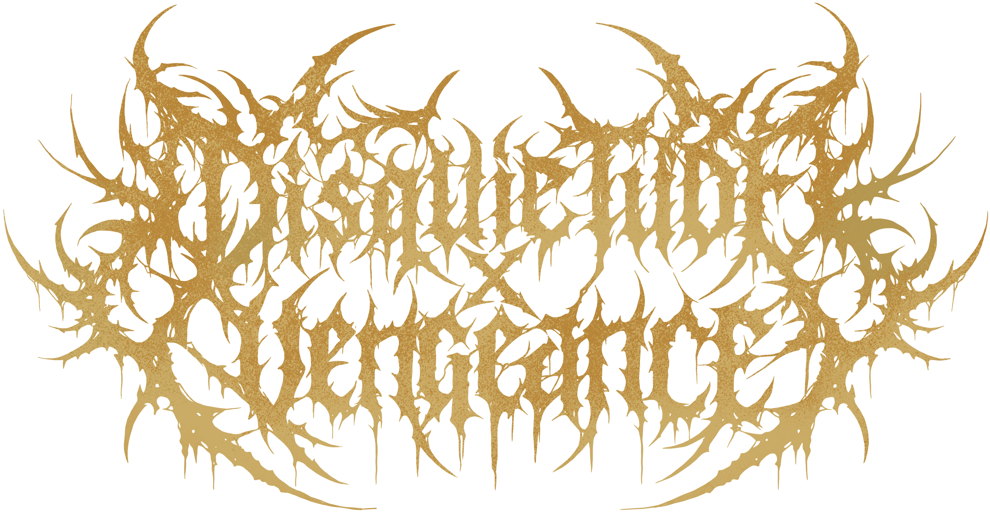
The previous Disquietude Vengeance logo belonged to an earlier chapter. It was cleaner, more readable and carried a different visual character. As the band evolved, it no longer felt aggressive enough to represent where the music had taken us.
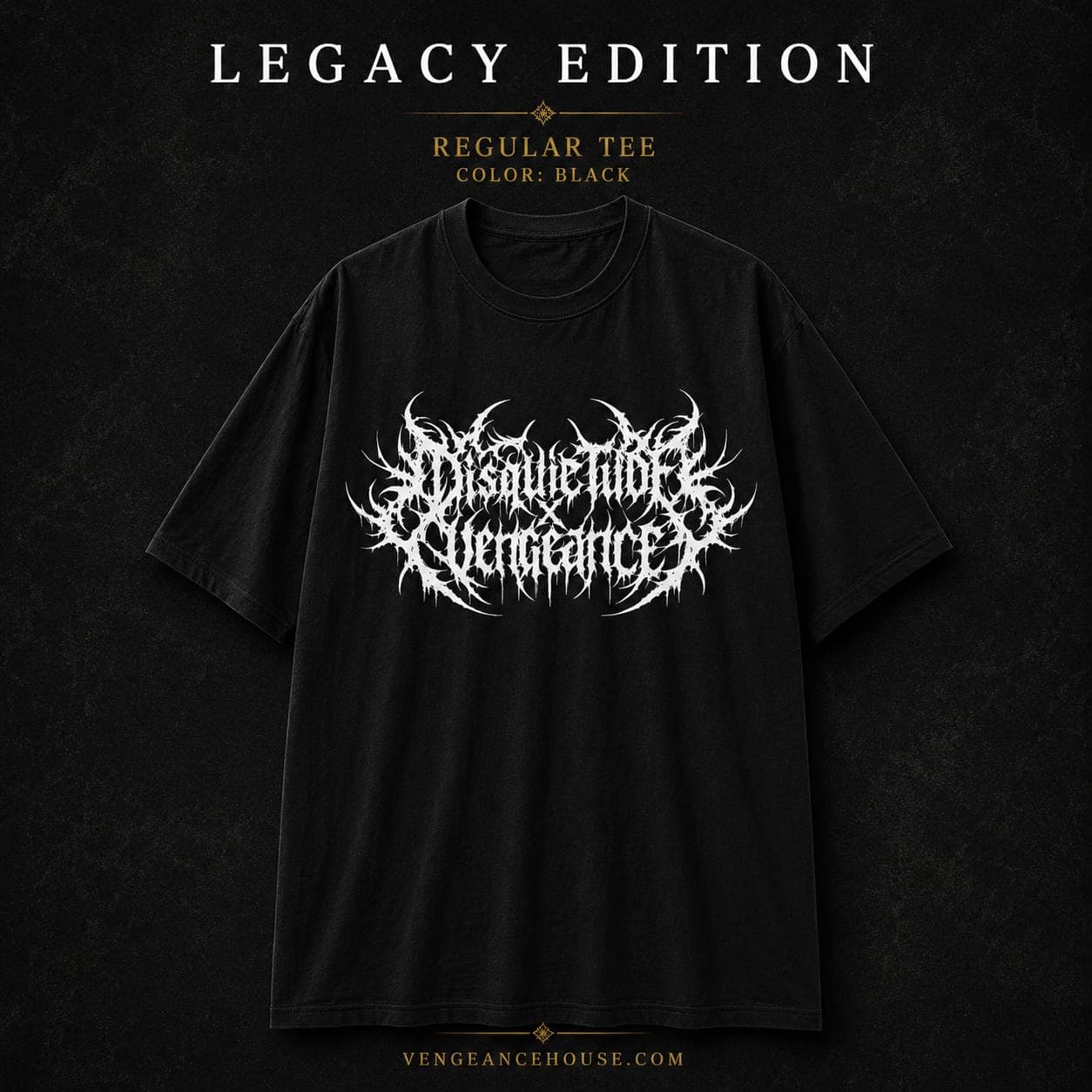
The new logo was created to feel more violent, chaotic and attacking. The sharper forms and tangled structure make it harder to read at first glance, giving it the raw visual character that belongs to extreme metal and deathcore.
It is not simply a new logo. It represents the visual evolution of Disquietude Vengeance and the direction we wanted the band to move toward.
Behind the Design
From artwork to physical pieces.
The new identity was developed beyond a digital logo. The artwork was created with physical applications in mind, allowing the new visual language to exist across merchandise and other physical pieces.
The hand-drawn artwork carries the same chaotic character as the new identity, giving the Disquietude Vengeance visual world a more distinctive and aggressive presence.